BRIDGEGOOD
Attracting Volunteers and Donors
Get Involved
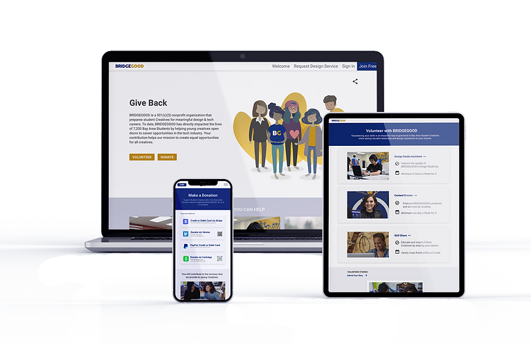
BRIDGEGOOD is a non-profit design studio supporting underprivileged students of color launch their career in design. Volunteer support and donations are crucial for the organization. I lead the team and worked on the UX/UI to create this "Get Involved" feature to encourage volunteers, donations, and support of BRIDGEGOOD.
Timeline
June 2020 - August 2020
Software
Adobe XD, Miro, Adobe Illustrator, Trello
Role
As the UX and UI Designer and researcher, my role was to conduct primary and secondary research, ideate solutions, wireframe, and prototype. I developed the desktop version and parts of the mobile version.
Team
Shaun Tai (Project Lead), Trung Hyung (Engineer), Benjamin Raymonvil, and Alize Fletcher-Carrillo
Project Overview
BRIDGEGOOD is a non-profit design studio that helps underprivileged students of color launch their career in design. Volunteer support and donations are crucial for the organization. I lead the team and worked on the UX/UI to create this "Get Involved" feature to encourage donations and support of BRIDGEGOOD.
Problem
Users showed interest in volunteering, but could not find volunteer opportunities on the website. Supporters who wanted to donate were not able to figure out how to donate through the website, encountered roadblocks, or found the donation avenues to be questionable in validity.
Goal
Reinvent and expand ways for people to support BRIDGEGOOD and its mission.
Status
Selected for development.
CHALLENGE
How can users easily get involved and meaningfully contribute to the studio and their causes?
BRIDGEGOOD relies on support from the community in order to deliver the most impact to the most people. However, their website did not explain their volunteer opportunities anywhere. They had a scrappy donation page with icons representing the ways to donate, but at best it was a half-effective way to donate (with some icons not working on some devices) and at worst looked like a low-security way to donate.
01 UNDERSTAND (Lightning Talks)
Understanding the business problem and opportunity.
In order to understand the challenges within this organization and website and what the most fruitful design opportunity may be, we did lightning talks with the program leads. From our interview, we learned that most users discover the platform directly through BG staff who visit classrooms to speak with students. However, 99% of user interactions comes to a halt once they upload a few projects to their portfolio. The 1% who stay engaged have in-person (or Zoom) interaction beyond the portfolio. More fundamentally, many users do not seem to even realize that BRIDGEGOOD is a non-profit organization, or that there are volunteer opportunities.

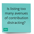
ASSUMPTIONS / QUESTIONS
Before we dove into research, we wanted to make a list of assumptions and questions we had around our problem statement.
How long or detailed should the organization description be to encourage contribution without deterring readers?
Is listing too many avenues of donation distracting? Which avenues are most useful?
Do people visit the donation page only when they intend to donate?
Who is donating?
What information do people need before volunteering? Donating?


03 COMPARATIVE ANALYSIS
Looking towards other non-profit websites helped to inform our design.
We analyzed websites of organizations such as the Oakland Zoo and Getty Museum and noted the strengths of each website’s “support us” sections as well as areas we could take and improve upon. We were particularly interested in the navigation and prioritization of the various ways to donate and volunteer.
It seemed to always be lower on the menu of the top nav bar. This fairly prominent placement made it clear that this was a nonprofit within seconds of exploring the website, so we thought it important for BG to also have it within the nav bar.
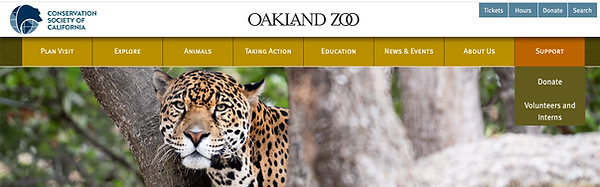
"Support" is its own tab in the nav bar.

Multiple donation options provided.
RESEARCH
Six existing and former users were interviewed to answer some questions regarding volunteering and donating.
Credit Card, Venmo, and Paypal were the most popular forms of payment, though a couple users expressed hesitation at donating a large amount through Venmo.
Users who had volunteered with BG often learned about it through word-of-mouth, but most interviewees did not know of any volunteer opportunities and expressed they would be interested if they had known.
Criteria for volunteer interest included: career-related, short term vs long term, payment.
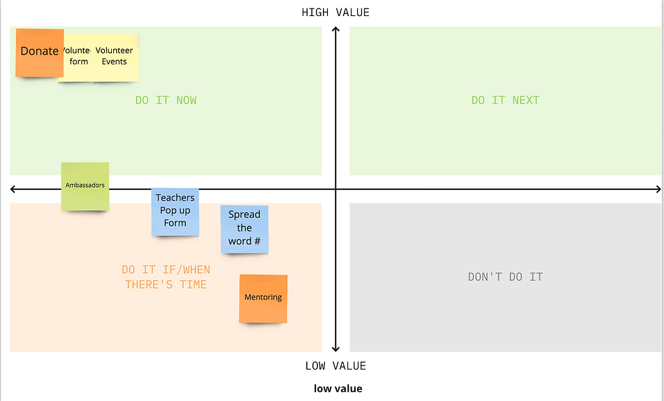
3 SKETCH - Crazy 8’s
Quickly sketched out ideas using Crazy 8’s and dot voting, to hone in on the best layouts and flow.
Taking what we learned from the interviews and comparative analysis to create our sketches. We initially had 6 avenues to contribute: Donate, Volunteer, Outreach, Join our Team, Partner, and Events.
We used a Value-Effort Matrix to hone down our avenues and got down to: Donate, Volunteer, and eventually added in Shop Our Store.


STORYBOARDING / USER FLOWS
Created multiple storyboards and user flows to capture the mixed user base.
We created a few different storyboards to capture the majority of our audience: students who are looking to gain experience and give back through volunteering, and supporters who are looking to donate.
Our team separately created User Flows for each avenue of contribution, and then combined them into one user flow. We ensured that it was simple to get to each feature, and that everything functioned in a logged-out state aside from signing up to volunteer.


WIREFRAME / PROTOTYPE
We created wireframes that we converted to prototypes in XD.


USER TESTING
We iteratively updated our prototype as we went through a few waves of user testing.
Since we found that most donors were already connected to the organization in some way (parents of students, partner organizations, mentors), we did not need so much information in our donation page. Instead, we could simplify it to a simple explanation of the mission and how the donations help, as well as some engaging photos.
On the other hand, the volunteer opportunities needed more explanation as these would more often be found by users who may not be as connected to the organization. Users wished for FAQ’s for the volunteer options as they felt that volunteering was a large commitment and would require extra information before signing up.
Nailing the 90% of users (mostly supporting organizations, supporters of students)
Chose the top payment options that 90% will use, but gave more options further down as we wanted to keep the page simple yet allow for users to donate in whichever way was most comfortable and available to them.
Considered how to get users to the page - initially had it within the homepage. However, the homepage is quite long and diluted with images, and furthermore we felt that users often are already intending to donate or find an opportunity, so having it in one location could be useful.
%20-%20Phase%206%20-%20Validate%20(User%20testing).jpg)
RESULT
Our feature was selected for development by the CEO.


TAKEAWAY
Nailing the 90%
Nailing the 90% was a strong takeaway here. I was passionate about ensuring that we captured the needs of all users, however, this is not always feasible and in many cases will lead to taking away from the experience of a large majority.